
GrahamH
Forum Replies Created
- AuthorPosts
- September 3, 2010 at 1:55 am in reply to: what now for Irish Times D’olier Street buildings? #749338
GrahamH
ParticipantBefore

…and, er, After

Dear oh dear.
The iconic curved corner, Before and After.

The occasional spalled brick and parts of decayed pointing were repaired with a yellow mortar.
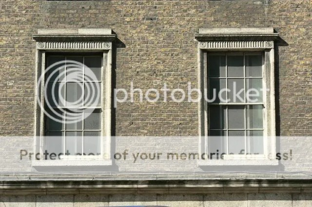
A beautiful ivory has been chosen for the sashes, most of which are reproduction. Only the very occasional original sash with glass survives.

As can be seen, a system of secondary glazing has been installed, whereby what appears to be an aluminium frame with a central horizontal glazing bar divides the inner window into two separate casements that open inwards. Very effective when one doesn’t have shutter boxes, but alas unacceptable that their street face is white. It should be black or grey. This is easily done with modern aluminium products and should have been insisted upon in a prestige terrace such as this.
One of the distinctive and little known features of this WSC terrace is that the attic level is principally a dummy storey. All of the squat attic windows are consumed to the rear by their roofs, presumably on account of the shortfall in funding the WSC experienced in the opening years of the 19th century. They wanted to economise while keeping up appearances. And standards – which is more than can be said of today. All of the attic windows, with the exception of the curved end where an apartment occupies the attic floor, have been fitted with horrendous mirror glass! An entirely unacceptable state of affairs.
How on earth was this permitted by DCC?

Shocking stuff. In all honesty, is there anything DCC does not deem as being up to standard? Does it even have standards?

In the case of the red brick houses, not even the rubbishy modern casement windows with mirrored glass were extracted!

The vast majority of the upper floors are offices. There are four small apartments in the entire complex, all located on the corner of D’Olier Street and Fleet Street in the curved corner. Each is of two bedrooms, with a kitchen-cum-living room where one is expected to dine at a breakfast bar if space in the dinky ‘living room space’ is to be preserved. What a crying shame in such fine buildings.
Around the back and, well, I don’t think anyone knows what’s going on here. Evidently never resolved from the outset in the early 1800s, or compromised over the years through addition and modification, this area, in spite of its historic fabric, required more serious intervention to sort it out. But it wasn’t.

As seen to the left above, a former doorway infilled with mismatched brick was left untreated, and appalling grey ruled pointing pasted over the whole lot. What an unholy mess.

The Wide Streets Commissioners would be rolling in their graves at this standard of finish fronting a prominent public space.
Indeed, this odd kink in the street is now left without proper form or function. Even a nice seat for the patrons for the 150 bus would be a simple, useful and elegant gesture.
 September 3, 2010 at 1:46 am in reply to: what now for Irish Times D’olier Street buildings? #749337Participant
Alas, up close, matters cheapen considerably, when the overly synthetic coating of the metal becomes apparent and the nasty bands of silicone catch the eye.

A shame.
It is somewhat made up for by the stunning surface-mounted lettering above. Supremely elegant.

The corporate entrance hall within. The new home of the Irish Aviation Authority. What a contrast from their premises on Burgh Quay; couldn’t get out quick enough one imagines.

The cleaning of brick and conservation of sash windows has been one of the positive notes of this development, even if large scale cement pointing was not removed.
Before

After

Before

After

Before
After
 September 3, 2010 at 1:42 am in reply to: what now for Irish Times D’olier Street buildings? #749336Participant
Repairs and reinstatement of missing details on original fabric has also been sorely lacking, This is the standard of repair work undertaken across the board.

Mortar specification for even the most basic task of joint filling is clearly inappropriate. Compare the refinement of the original with the new.

Entire mouldings have been crudely built up using a dense, grey plastic repair mortar instead of splicing in new stone. It has also been liberally smeared over wherever a gap was encountered.

This ugliness stands in stark contrast to the works executed by The Irish Times c. 1990. Compatible granite carefully spliced into place.

Unlike the current project.

Arguably decay of this kind is part of the integrity of the historic fabric. But a simple form such as the above does warrant careful splicing. More elaborate carvings should be left alone.
The iconic corner capitals are in a good state of repair.

All stonework appears to have been sensitively cleaned. Before and after.

Again, excuse the hanging baskets. Somebody please save these people from themselves.

The focal point of the new development is the remodelled central shopfront of the 20th century houses, which retains the older granite insert as a striking proscenium arch. One may stand at ideological loggerheads over the failure to reinsert the original shopfronts, but on its own merit, HKR have done a fine job here in concept, if not quite in execution. The new entrance and flanking window fronts a large reception hall, reading to the street as a confident, yet reticent, crisp insert in the mellow granite surround. Really quite beautiful.

The tinted glazing is sultry and elegant.
 September 3, 2010 at 1:37 am in reply to: what now for Irish Times D’olier Street buildings? #749335Participant

Secondly, the detailing is shockingly bad. Below is an original vigorously carved, idiosyncratic Ionic capital with ebullient egg-and-dart detail.

And here is the cartoon edition of the 21st century.

A shameful lack of effort. The detailing couldn’t be weaker and stiffer if it tried. The egg-and-dart is a disgrace.

In addition, the elegant ridge profile beneath the base of the capital was not reinstated during reproduction. This feature adds considerably to the elegance of the piece – its omission is regrettable.


The same practice can be seen on the new pilaster plinths at pavement level, where the fine ridge detail of the original in the background is omitted on the new in the foreground. And mortar slopped all over the base of the pilaster to boot. Appalling.

Worst of all is the neoclassical fluting employed on the new doorcase lintels. What was once an array of 30 deep and forceful incisions into the coarse granite…

…is now 44 weak marks virtually polished into the new white granite. You couldn’t make this stuff up. Who on earth conducted this work, and who oversaw it?
The same can also be asked of the shoddy construction detail. Finnicky bits stuck in to fill the gaps.
 September 3, 2010 at 1:36 am in reply to: what now for Irish Times D’olier Street buildings? #749334Participant
This is where the project really begins to fall apart.
Standing back from a singular planning application lodged for a development on D’Olier Street, Dublin City Council by any reasonable standard ought to have had, at the very least, a vision for the future of this critically important terrace, notwithstanding the obvious need for a design strategy agreed upon in-house. First identified by the O’Connell Street IAP as far back as 1998 in requiring refurbishment extending to O’Connell Bridge, the significance of the terrace was further highlighted in a second Dublin City Council policy document: its Shop Front Design Guidelines. In this, Howley Harrington Architects went to considerable lengths to again reiterate the design importance of the terrace and showcase the impact of full unification as originally constructed. Not only were all shopfronts shown reinstated, but upper floors were similarly unified through fenestration and removal of various adornments.
The starkly illustrated scene.
Before

After

They emphatically stated: “A proposed restoration scheme is illustrated, showing how impressive this fine urban composition could be if the original detail was to be reinstated. The shaded area on these two drawings highlights the splendid granite surrounds which are such an important feature of the street. When parts of these are removed or distorted, the overall rhythm and composition of the terrace is lost, which reduces its visual and architectural integrity. If reinstated, this cohesive, colonnade-like effect would unify the entire terrace, making it a most impressive and truly significant piece of historic urban design.”
Need any more be said – it couldn’t be put any better.
In spite of this, however, and the substantial public funds paid for such expert advice, architects, planning consultants, public planners and conservation office staff all chose to ignore it and plough ahead with whatever was flung over the planning desk. It simply beggars belief.
Indeed, not only was the principal, critical theme of unification blatantly ignored, this development went out of its way to reverse the consolidating works carried out by The Irish Times. The gobsmacking ignorance involved in removing an expertly applied mortar or colourwash would seem like a joke were it not now standing there for all to see. What makes this all the more galling is that the 20th century brickwork, unbelievably, is a fact a façade retention. Not only was the chance not taken to re-colour the red brick facades after cleaning, the unique opportunity to right an horrendous wrong and rebuild the facades in yellow brick was not grasped either!

Astoundingly, these people went out of their way to retain one of the most degrading elements of any historic streetscape in Dublin.

Likewise, the cumbersome detailing of the 20th century granite surrounds with heightened sills was not even remedied.

Where on earth were the Conservation Office on all of this? Goodness only knows, as the planner’s report states that the Conservation Office expressed no concerns over the development aside from the impact of suspended walkways at the back of the building! Was the historic assessment highlighting the red brick facades even read? Was the especial importance of the terrace and its shopfronts even recognised? Were the photomontages of the office development even looked at? And what conservation professional monitored these works? And, incidentally, where were the Department of Environment on this – one of the few applications affecting historic buildings of prime importance in the State, to whom this application was directly referred. Why was there no objection from there? In effect, what is being exposed is a gaping hole in structures of conservation input and expertise, unlike where in Britain an application of this stature would be almost single-handedly guided to the stringent requirements of English Heritage. Here, it’s a complete free-for-all.
The same absence of standards can be seen with the shopfronts, where unification was not enforced. As previously noted on this thread, the observation lodged by An Taisce urging the restoration the missing original shopfronts and quoting the DCC Shop Front Design Guidelines doesn’t even appear to have been understood by the case planner:
“In terms of the proposed shopfronts, the concerns of An Taisce are noted. It would appear however that these concerns are largely met in the proposed development which proposes the refurbishment of the existing shopfronts. Details of signage will be required when end users of the units are identified and details of this aspect should be made the subject of compliance.”
How can the needs of reinstating by met by not reinstating? Either they are or they are not. The existing shopfronts are entirely irrelevant. As a result, only part of one solitary shopfront was pieced back together – the rest remained as is. Seen below, the minimal granite surrounds installed by The Irish Times, though handsome in their own way, fail to do justice to the terrace as a whole.

These were all left untouched.

The works required to bring these back to their original format is actually much less that first impressions suggest, as the magnificent original panelled granite frieze survives above. All that is required is the insertion of minimally carved pilasters and doorcases to the lower levels. The lack of vision displayed with this project would make one weep.
However, observing the standard of reinstatement of the solitary shopfront at No. 9, it is a matter of some relief that the reconstruction of the missing shopfronts did not form part of this project. The quality of works is shockingly bad. For this standard of workmanship to be employed on a laneway of a provincial town would be bad enough, but on the most important Georgian commercial terrace in Dublin, with original carving serving as an informing template flanking each side, is entirely unacceptable.
Firstly, the granite chosen, unlike that sourced by The Irish Times, in no way matches the rust-toned Kiliney or Golden Hill granite employed in the original shopfronts as seen below.

It is virtually white.
 September 3, 2010 at 1:35 am in reply to: what now for Irish Times D’olier Street buildings? #749333Participant
From the far end of Pearse Street the hulking mass of incoherent clutter of clip-on cladding, services and railings rears its head to double the height of the low Wide Streets Commission curved composition in front.

The new building’s crumpled facade to Fleet Street has admirable sculptural qualities and is well detailed, but again is at least a storey too high relative to its surroundings.

The view from the street in certain light is striking and elegant. Quite clearly this solitary element sufficiently bedazzled the planners in typically flashy fashion to wave through the entire scheme unhindered.

It gets cheaper looking when the sun catches the television set cladding.

The new building is linked to the WSC terrace by means of an atrium: a common ploy that generally works well with tight sites and historic buildings with unremarkable rear elevations.

Formerly intended as a signature corporate entrance, it appears this has been significantly downgraded over the course of construction. The humdrum entrance as built.

It leads into, well, this.

Er…
Returning to the wider composition, this was the site as proposed.

And as built. Damn you skip.

There is of course one glaring difference. Two red brick houses slap bang in the middle of the terrace.

Complete with that penthouse storey.
September 3, 2010 at 1:35 am in reply to: what now for Irish Times D’olier Street buildings? #749332ParticipantDISASTER ON D’OLIER STREET
The failure of built environment professionals to understand the composition of historic Dublin has allowed a golden opportunity pass though the city’s hands, while compromising its finest Georgian streetscape legacy.
Any visitor to D’Olier Street over the past number of weeks cannot fail to have been struck by the newly refurbished handsome terrace that comprises the thoroughfare’s western flank. In the warm morning light of late summer, the mellow brickwork and regularity of marching ranks of fenestration present an eye-catching spectacle to the passer-by, and to the hoards of crowds waiting for buses in the gloomy shade on the opposite side of the street. The buildings are commanding, strong, stoical, yet gracious – at once the essence of historic Dublin.

Conceived by the Wide Streets Commission in the final years of the 18th century as part of the iconic triangle of newly planned streets in the ceremonial centre of Dublin, linking College Green with what is now O’Connell Bridge, D’Olier Street, as with its sister streets, was remarkably innovative for its time. Laid out on a grand scale, matched by a strict architecture of the regimental classical school, the street was ambitiously lined with shop units to the ground floor with living accommodation in the floors above, faced with rigidly proportioned facades of yellow brick with minimal granite dressings. Eventually completed by the early 1810s, this was a mould-breaking development in Europe, pre-dating the establishment of formal retail streets such as London’s Regent Street, and placed Dublin firmly on the international stage.
As the sole surviving Wide Streets Commission terrace in the capital to retain substantial original fabric and design coherence, the former The Irish Times terrace on D’Olier Street is a collection of buildings of not only unique and special importance to Dublin, but is an urban streetscape of European significance. On either of these levels, the terrace demands the highest standards of building conservation, restoration, and design excellence, based principally upon a thorough understanding of the design significance of this terrace. Everything else is secondary. What we have just experienced, however, is a shambles. Ignorance, apathy, poor execution and good old fashioned arrogance are themes that define this project.
By the late 2000s, the former The Irish Times terrace was tired, worn, ill-equipped for modern use and in dire need of restoration. The Irish Times had invested significant funds on the exterior of the terrace in the late 1980s in an attempt to recreate something of the design intention of the WSC, involving the insertion of minimal granite shopfronts where original shopfronts had been lost to create a coherent rhythm along the street, and the removal of façade-mounted signage, plastic fascias and wiring. As part of this project, an expert bricklayer was invited to Dublin from Nottingham to resolve a major fault in the middle of the terrace: a pair of houses that had been rebuilt in red brick in the mid-20th century. An alleged fire that broke out in 1973 has been attributed as the cause of this, however the disastrous fire of 1951 that destroyed much of the printing works to the rear seems more likely. In any event, the houses were rebuilt with a steel frame structure and a glaring red brick façade – red brick probably being perceived as typically ‘Georgian’, in spite of the obvious uniform yellow brick context. The re-colouring of the red brick was remarkably successful; as seen below, after a few years of grime the difference was almost imperceptible.

Stern and forbidding, the unity of the terrace was admirably restored.
In 2006, developers P. Elliott and Company bought the terrace for €29 million. Clearly the principal aim of the project was to maximize site value through the redevelopment of the former printing works to the rear. Remarkably, they achieved this with gusto, with the application for an arrogantly over-scaled seven-storey office block over basement car parking sailing through the planning process without so much as an appeal.
Works underway.


An Taisce’s observation in relation to the penthouse storey over the red brick pair being intrusive and inaccurately represented was dismissed by the case planner as the extra storey not being “visually dominant when viewed from either the Westmoreland Street or D’Olier Street areasâ€. The weak report concluded, “Overall it is my opinion that by virtue of the scale of the penthouse level and the degree to which it projects above the parapet, its location between two chimney elements and relationship to the overall façade composition and existing roof elements, that this element would not be excessively visually prominent and would not have a negative impact on the character of the D’Olier Street conservation area.â€
Indeed. Just what about the rest of the development?

Such spectacularly ill-informed decision making, as was rife during the boom years, has resulted in this outrageous spectacle. To think we have learned nothing a decade on from the Westin.

No matter where you turn, there is no escaping this arrogant, mindlessly inept, chronically un-contextual pile of junk. The most important vista of all below, from O’Connell Street, is jaw-dropping. Do these people – architects HKR and Dublin City Council planners – know anything about what they’re dealing with? How could this possibly happen in 2007 in a sophisticated society? The very icon of 18th century street planning, defaced by plastic penthouses and service plant?

Truly, how has it come to this, two decades after the famous ‘bungalow’ was dumped on top of the apex of the two streets as part of an illegal pastiche re-erection of WSC buildings?

Even basing a fallacious justification for this on an arrogant declaration of a contemporary design statement, it still collapses on its face by virtue of the expressionless, tarted-up, prefabricated biscuit tin spin-off from Hawkins House that has been excreted on top of this masterstroke of urban planning.

Of course, the impact of the above was selectively depicted in the planning application, as overseen by John Spain Associates planning consultants, from the western side of O’Connell Street, where it was naturally concealed. Views from the GPO were depicted with the clipped lime trees in front of the camera. Infantile stuff. But of course it worked wonders.
ParticipantAh now Devin – that was a rather ridiculous proposal that was invasive to boot. Just plain silly looking. Typically, the colour wasn’t declared in the application either, other than the giant apple would have an ‘enamel finish’.
The new unauthorised signage on the columns is cheap and ugly. The unauthorised green band over the door is acceptable, but the previous signage was better.
I see Spar across the road are up to their old tricks again covering over their chromed signage, this time not with a banner, but an entirely new sign! As for the rest of the street – the place is just falling down with crass unauthorised development, much of it on foot of recent planning applications with completely ignored conditions. It is tiresome listing it all. Planning control legislation just has to be changed. Not only could an instant reversal of unauthorised development take place, fines could be a real cash cow for Dublin City Council if there will was there. But it’s not.
ParticipantAlas yes archipig 🙁 – and it’s unauthorised. They erected beautiful chrome plaques when they first moved in, before promptly taking them down and erecting green tackorama on the columns which kinks as they wrap around them, and another green band over the door. Such a shame. No style.
ParticipantNot something that can be said of this new job over on Nassau Street.

Okay, so this really surmises the jist of what this whole post is about. Yes, it’s all very well and good to get on the phone to Peter the Painter and get the windows ‘done’, get the walls ‘done’ and the place ‘cleaned up a bit’. But these buildings are not 79 Glenwood Drive in Knocklyon – they are substantial historic properties on the principal streets of the capital that demand, never mind require, a coordinated design strategy before a paintbrush is even applied. And we must face up to the reality that, far from things having become more sophisticated during the boom years across the board, we have lost huge craft in even the deceptively simple task of painting a building or shopfront. Many firms don’t have clue how to identify a building, never mind its constituent parts, or the colours that may be appropriate for each, or the building as a whole based on its period.
Here we have a totally wasted expense on three buildings that looked better before work ever got underway. The central ebullient building, the former iconic Jammet’s restaurant, has effectively been erased of its stucco dressings, while adjacent brick buildings have had yet another thick layer of paint applied over their original facings.


Above and below are the same view with half a century in between.

Mercy, the art of the shopfront has been lost…
But the point is, this is an example of funds being misdirected because there are no mechanisims in place like in other cities at municipal level to offer assistance or direction in these matters. Had the substantial money invested in scaffolding, labour and paint been diverted and topped up by a free rotating scaffold by DCC, a small facade improvement grant provided by a lottery fund, and expert advice provided in house by a small DCC architectural team, these properties could have been restored to their full potential. The central bulding could have had an appropriately vigorous paint scheme employed, while the two adjacent buildings could have been stripped of paint and render where possible, the original brick exposed, and appropriate fenestration reinserted.
The brick of the right-hand building survives with apparently fine tuck pointing.

As for this once fine two-bay house. What a complete mess. These buildings, even with all the will in the world by owners, will never achieve their full potential without the input of the planning authority, and in particular the initiative of the planning authority to identify buildings such as this and take action to address them.

A dedicated design team is badly needed specifically to tackle the presentation of facades of Dublin’s principal and secondary streets. Let’s even get the main ones right to begin with.
Including St. Stephen’s Green.
 Participant
The below picture may need to be refreshed.

Quite a transformation.
But again the job played it safe with uniform paint colours on two very different buildings (and rare in style in the Dublin context at that), while also failing to tackle structural issues such as the reinstatement of a tripartite sash window on the middle building (where the window is used as an electronic billboard at night) and cabling continues to marr the shopfronts.

I really want to support the new Centra store and adjacent unit (out of shot) and the design concept behind it, and most of it is indeed successful, but there are issues of odd materials, dodgy proportions and cumbersome lighting units that sadly let the ensemble down for me. Good to see they’re complying with their postering planning conditions and lofty aspirations to upmarket presentation in their application :rolleyes:
Up the road on Lord Edward Street, the oldest building on the thoroughfare was recently refurbished for use by the social services next door. Aside from multiple Victorian doors, architraving and skirting ending up in numerous skips out on the road, things were going swimmingly with a lovely new coat of soft green paint applied to the doors and window of the charming original limestone shopfront.

Until the lady in charge told the painter she didn’t like it, got him to repaint the entire thing in er…


“I-a, I-a preferred da aaader color toooo – this is very biiiiight!!†he told me. Listen to your painter missus…
The Legion of Mary comes to Lord Edward Street.

Pity that clunky fascia didn’t come down; looks like there’s a nice slab of limestone underneath it. Lovely new lettering applied nonetheless.
Nice cleaning of a smart Edwardian over on Exchequer Street.

No white paint – yay!

Sultry and sophisticated. Perfect.
ParticipantThe painting of the ground floor highlights the mismatched nature of the shopfronts. Some unification would be desirable here.

It also highlights a broader issue: namely that the two distinct properties here really should have been given different decorative treatment, with the five-bay building in the distance being the most cohesive, with elegant shopfronts and good quality stucco to the upper floors. Painting everything the same colours confuses the design intention of the stucco adornments – their very function being to differentiate buildings on the street.

Rickis on the corner steadfastly refusing to get in on the act of course. Indeed, he went out of his way to advertise his place during works, with naff stickers applied to every conceivable pole around it, and a large sign tacked up around the back of the building which hasn’t come down since. A class act.
Like the flagpole holders. There’s always some addition forgotton during painting!

There are white uplighter lamps being trialled above the shopfronts at the minute.
The doll’s house rear of the Mercantile on Dame Lane has also been painted.

Nearby on the corner of Exchequer Street, the corner restaurant has changed hands for at least the third time in as many years. Finally, a beautiful new treatment after a ghastly white scheme applied by the last tenant.

Pavement barriers are generally highly disagreeable, but in this instance they are understandable at this busy junction. A fine design too.

These guys know what they’re at.

Back to Dame Street again and the South Great George’s Street junction. Finished for quite a while now, two of the most prominent eyesores in the city have just been given a lick of paint. Terminating the vista of George’s Street stand this frothy collection assemblage of Victoriana. This is the newly completed paint scheme.
The right-hand building was not treated as part of the works.
Some before and after shots.

 Participant
26/8/2010
A recent flurry of improving works involving a number of properties around the city centre in recent weeks and months has served as a potent example of what can be achieved with a lick of paint – even if in some cases it has worked to questionable effect. The summer months really do seem to bring out the industrious spirit in people.
One of the largest scaffolds erected in Dublin on an existing building in recent years dominated the centre of Dame Street for much of the summer.

The building at the junction of Dame Street and South Great George’s Street got a much needed sprucing up after decades of neglect, as with countless historic properties in the city centre.

The final stretch of a Wide Streets Commission terrace dating to the 1780s, adorned with Victorian stucco adornments, the Mercantile Hotel presented a grim aspect to Dame Street with a grubby white façade accented in black – typical of the 1970s.

The transformation has been nothing short of a breath of fresh air.
It is like a switch has just been flicked.

As can be seen, in addition to the main facade, the previously unpainted gable end of the last house – which has remained exposed since the 1930s when the terminating house was demolished to improve the operation of the tram line – has been given decorative treatment for the very first time. While it has lifted matters considerably, it has to be asked if this measure merely consolidates the exposed gable end’s position here for all eternity. Likewise, the once gritty, raw and urban rendered gable hinted at a troubled history – a curious wound on the streetscape. Now it just looks like a mediocre suburban solution to the back arse of a garage. Still, that marvellously handsome chimney stack elevates it beyond the ordinary. And as the precedent for one of Zoe’s Mountjoy Square houses, it can’t be all bad!
A subtle and elegant use of colour.

The next person that says double-glazed panes don’t alter the appearance of a building can go stick their head under a closing sash.
The beautifully painted new shopfronts. An interesting choice of colour. Nothing inventive going on here (somebody show these guys a Cushman photo or two) but satisfactory nonetheless.

This of course is one of the most charming shopfronts in Dublin – precisely because it’s not off the shelf. The glittering, hand crafted coves have always been a delight.

What a difference simple tables and chairs and a few potted trees make, both to an architectural ensemble such as this apse as well as to a wider street.

We shall be keeping a close eye on these lads. How long shall we give before the novelty wears off, things get battered, banners and canvas railings start appearing, the postering goes up… We’ll give them the benefit of the doubt.
 August 24, 2010 at 9:29 pm in reply to: reorganisation and destruction of irish catholic churches #774233Participant
What a marvellous body of research by Brendan Grimes – an outstanding record.
Sadly the home of John Leeson, sited next door to Price’s Medical Hall on Clare Street, was demolished for one of the Gallagher Group’s pastiche specials.
ParticipantThe only reason that Eircom are hanging onto the boxes is that they’re now using them for very lucrative advertising space. Virtually all of their boxes are now covered head-to-toe to blackout advertising for their broadband services – a ploy they’ve been using for a good while now. The difference on a street between an elegant, transparent box, and a leaden lump clad in orange tack is extraordinary. Who regulates these things?
Great to see the rollout of the wayfinding signage. Sadly it would appear there are no panels to be erected Stephen, though I could be wrong, as all post insertion works have been finished for a couple of weeks now – all of which, incidentally, have been conducted to an exemplary standard, as per the installion of the bike stations. We await the delivery of fingers!
ParticipantAnd they’re just the attic storey ones…
ParticipantWorkin’ on it!
As are Elliott’s with their B&Q hanging baskets. Classy bunch as ever.
August 16, 2010 at 12:04 am in reply to: reorganisation and destruction of irish catholic churches #774185ParticipantIndeed. It has to be one of the most soulless churches in the city on account of these works. What a travesty.
ParticipantHa, no Arnotts is still trading reasonably well. It is still without question the king of Dublin department stores, with the advances Roches were making being pulled back a decade by Debenhams, Clerys remaining a basketcase and more isolated than ever, and Brown Thomas increasingly finding itself priced out of the market. Arnotts has the most flexible business model and the most diverse range of departments to help weather the storm and keep itself relevant to the consumer. It’s just a bit of a headache that there’s a €250 million-plus debt lingering in the background… If there’s one area that needs serious reordering, its their Kitchenware department in the basement which has gone down the tubes in the past couple of years. There’s a big opportunity to be grasped in catering for the loss of that trade from Roches and other smaller stores that have vanished.
Most of us have probably noticed that the €10 million revamp of the existing store, including the removal of the external canopy on Henry Street and reopening of its magnificent original display windows, appears to have come to an abrupt halt since last November. Is this dead in the water too?
It was remarkable how little coverage the Arnotts redevelopment received back in 2007 relative to the Carlton site which has received widespread and sustained attention since its launch. The initial Arnotts scheme, gleefully rubber-stamped by DCC, proposed the most eye-popping over-development imaginable looming over Abbey Street, Liffey Street and Henry Street. This mindless stacking up of arrogant, formless and incoherent boxes merely designed to ‘contain’ XXX ‘units’ of half a million euro apartments, was in addition to a Liberty Hall squeezed onto the corner of Abbey Street and Liffey Street, a canyon of a new street entered from Henry Street (the concept itself an admirable one), and the most outrageous, bombastic recladding and stacking up of setback storeys on Penneys next to the GPO on O’Connell Street – without so much as a whimper from DCC or reference to their own ACA policy. Talk about a far cry from the expert architectural group of late 1916. As usual, it was left to a pitiful number of people to decry the latter dross being sent over from the UK from a so-called ’eminent’ architect of retail design, over whose illustrious work casting so much as a concerned glance, never mind an open critique, yielded a scornful look of pity last practised in Dublin following the opening of the doors to the mob after the Duke of Dorset’s viceregal banquets of the 1730s. The lack of commitment to architectural excellence on this, one of the most important sites in the State, was nothing short of frightening.
It took the Board to turn this scheme from a gratuitously overscaled, if broadly urban-minded development, into a contextual, fully integrated and principled urban scheme. DCC were quite willing to sell out the north inner city lock, stock and barrel for vast development levies and rates. It will be interesting to see how the banks handle their newly acquired assets: namely if they dispose of individual properties, in which case the masterplan collapses, retain strategic sites to eventually develop part of it, or develop the entire plan incrementally – if perhaps scaled down.
ParticipantA fun and non-invasive use of stenciling that harks back to the buildings’ former light industrial function.

Newly cleaned and pointed granite with attractive cast-iron grille.

Many of the railings appear to be newly cast – perfect to the 1840s. A lovely eggshell sheen.

The tuck pointing is highly accomplished. One of the top three re-pointed yellow brick buildings in Dublin. Finally we know what we’re at with pointing!

The stopping mortar is the perfect earthy colour. This is all so good you wouldn’t even realise it was restored. The ultimate benchmark.

Interestingly, when the middle building was built, its brick courses could presumably only be matched to one of the two flanking houses, hence why the pointing of the right-hand house at No. 54 ties in perfectly, but is entirely different in levels at No. 51. No. 54 was also in the possession of Crowe’s at the time the infill took place.
One of the most transforming spin-offs from this restoration has been the skillful removal of render from the upper façade of No. 51 (below), which has probably been applied in the 1920s. Luckily it appears to have walked off the soft brickwork. Its removal enabled the restoration to the terrace’s unified state of J. & C. McLaughlin’s alterations of 1899. The beautiful streetscape effect we have today could not have been realised otherwise.

Of course, as seen above, this restoration comprises part of a much larger new-build extension and apparent conversion of workshops for expansive studios, library and ancillary facilities, largely divided from the Pearse Street buildings by way of an atrium. This is naturally the main focus of the development, but as we don’t have access or pictures, we can’t really say much, other than judge by the glossy photographs and descriptions on the IAA page. Very dynamic and typically HJL Corporate TM, as workspaces they seem carefully and freshly designed. The linear emphasis of the studio is lovely and sharp.
I’m not sure if all of the new mega-block on Pearse Street is part of the same development, but either way it looks to be by HJL.

The materials and some of the concepts are attractive, but the executive clothing doesn’t hide the fact that it’s too big and too busy. The anonymity of the entrance also does it no favours, while leaving matters to canvas banners to declare a presence on the street is deeply unsatisfactory. Take these transient elements of non-architecture out of the equation, or even look at the building head-on, and one is left with an expressionless block – a giant pair of sunglasses stranded on the corner that doesn’t know where it is, and people don’t know what it is to help it on its way to feck off somewhere else.
It is discernable how the character of this stretch of streetscape has now changed, where once the unified, if compromised, composition of Nos. 51-54 served as the signature building along here. By all accounts hierarchies can change, but not in such a crude manner, where scale alone takes over as an all-consuming factor, rather than design merit. It is frustrating to see such an arrogantly scaled, blob of darkness steal the limelight from a distinguished set piece that has graciously served this street for 150 years. Smaller and simpler, it could and should have been better.
- AuthorPosts