
GrahamH
Forum Replies Created
- AuthorPosts
GrahamH
ParticipantPart of the reason the Ulster Bank was the last to be completed was the fact that the construction site was hit by a labour dispute in late 1920. The Civil War in 1922 also damaged the yet to be finished building.
As posted on the thread before, this fascinating image from November 1922 shows very clearly the terrace in its newly reconstructed state with the sole exception of the Ulster Bank premises which is still under construction and the canopy of the nearby Grand Central Cinema yet to be erected.

Both the dome and roof were damaged in the Civil War – the dome is notably still absent over three years after construction began.

Here it is again with the ground floor shrouded in scaffolding during what is possibly Michael Collins’ funeral.


The building was finally completed in mid-1923. This is a view shortly afterwards around 1925, the dome still dark in colour.

And today.

In the early 1960s, the adjoining red brick premises at No. 2 Lower O’Connell Street was acquired for the expanding bank. It originally featured an elegant, probably limestone, shopfront with piers to each side.

One of the most elegant compositions on the street is its delightful first floor tripartite window of crisp limestone.

Around 1976 the original street level frontages of both properties were removed and amalgamated into a single shopfront. It was an appalling development, creating a vast expanse of dead frontage at the entrance to the street, with seedy squinting little windows allowing for a scrap of light into the dingy interior.

A bizarre concoction, it features both historicist channelled granite and Brutalist concrete box units beneath the delicate Portland balcony floating above.
 Participant
Not until the Luas route is decided John. Which will be…
As mentioned above, what is probably the most ambitious development to occur on the street in relation to property improvement since the IAP was launched ten years ago was announced recently. Ulster Bank at Nos. 2-4 Lower O’Connell Street has lodged a planning application to reinstate its principal original shopfront and that of the adjoining No. 2 at street level as first built in the early 1920s. No. 3-4 is one of the grandest – if with a somewhat cumbersome attic storey – neoclassical buildings rebuilt post-1916 at the entrance to the street, with its distinctive copper dome piercing the middle of a terrace a unique feature in the city.
Here is the building today, competing with the adjacent Bank of Ireland to the left for dominance in the terrace. In spite of the dome, it loses the battle.

As mentioned, all of this side of the street up to Cathedral Street was completely destroyed in 1916 and took some seven years to rebuild. Ulster Bank was the last building to be finished , throwing open its doors in July 1923. The conservation report that accompanies the recent application gives a little new information, but doesn’t give a more rounded overview of the history of the structure which is a shame. As a commercial report I suppose one can hardly blame them.
Some of these images were posted before, but it’s worth popping them up again in this context.
Below shows the terrace in 1898, roughly as the Wide Streets Commission had left it around 1790, though of course with many Victorian alterations. The double-plot modern day Ulster Bank site is outlined.

Here it is again c. 1901 with the bombastic addition of the Bread Company building.

And again in April 1916. Oh dear.

In the aftermath, plans were drawn up by an expert committee including the City Architect CJ McCarthy for a unified terrace along this stretch and elsewhere, but these were never realised.

© Dublin City CouncilThey certainly would have given O’Connell Street a more formal air.
Nonetheless, the terrace was rebuilt in a coherent fashion, with a unified cornice line and standardised building materials of red brick, granite, Irish limestone and imported Portland stone.
This fascinating image from 1920 shows the terrace under construction. Evidently the opportunity was taken to regularise municipal services too!

Very clearly you can see the modern day Irish Nationwide building on the corner approaching second floor level, while the diminutive slivers of the newly built red brick buildings at No. 2 and further up at No. 5 are standing unsupported.

The modern day Bank of Ireland at No. 6-7 appears to be shrouded in scaffolding. The Ulster Bank plot is still largely vacant, as the bank only acquired it a year earlier in December 1918. The foundations were laid in 1919.
According to the conservation report, the building was designed by one James A. Hanna, a Belfast-based architect who had worked on other Ulster Bank branches in Dublin, and with sculptural decoration by C. W. Harrison and Sons of Dublin. Here is his original design which was largely executed. Thankfully the dome ditched its squat quality for a lofty elegance along the way, though the windows here are more picturesque, while not so welcome was the toning down of sculptural detail across the facade.

Conservation ReportCosts were cut through the omission of balustrading to the sides of the first floor, while the sculpture as executed is much more applied in appearance than the structural, masculine quality of the elements proposed above.
ParticipantI thoroughly agree with you what?. For clarity, I didn’t mention anything to do with misuse – rather it was ctesiphon, in what I presumed to be a tongue-in-cheek remark. I’ve never been one for limiting expression or progress because of what ‘might’ happen – as had been argued about O’Connell Street before incidentally with public seating.
The reasons you outline are also the very reasons I like this insert: it is clearly that, a new patch sewed onto an old jacket, which has been elegantly and deftly expressed. It has no intention of accounting for the wider building, which is a clever and cheeky acknowledgement of its twilight years. The problem is not with the concrete, which is effective in how it reminds one of the wider 1960’s host structure floating above – rather it is the processed solid finish of the frankly hideous granite wall which throws the pared-down philosophy and clarity of expression evident everywhere else completely on its head. The development is engaging in two conflicting approaches, the latter of which is precisely akin to your description of naff deluding cladding tacked about a structural form, and is completely at odds with the expression elsewhere. Coupled with the curtain walling above, it looks all the more daft. Perhaps that’s the intention…
(Incidentally, I knew you’d jump on this on what? ;))
ParticipantWell isn’t that just it. It wouldn’t work at all otherwise, whatever of the current effectiveness. Indeed on structural grounds one would wonder as to the columns’ longevity. How close are reinforcing steels to the surface of the concrete, and how would the coarse aggregate fare upon (no doubt many) impacts?
Also the granite wall is bizarrely last-minuteish. It doesn’t remotely connect with the rest of the design, and in fact protrudes beyond the building line. Extremely odd.
ParticipantAs TLM mentioned, Irish Aid has just unveiled their chic new unit by de Paor Architects. A diamond on a sow’s ear if ever you saw one.


When the planning application mentioned waxing down the concrete, you assume it to be a chic polished affair, forgetting that the aggregate in question was designed to be clad in granite, so it’s extremely rough on exposure.

It’s attractive through in contrast with the glazing. Quite daring.

Still not sure I’m a fan given there’s finnicky processed finishes elewhere such as the paving and a rather predictable granite-clad wall beyond (and where limestone would surely have been more appropriate). I’m not convinced it knows what it’s at.

Good contrast with the sharp plaster ceiling.

The internal displays are very effective, projected onto what appears to be a combination of walls and screens. I expect the fit-out is of a very high standard.

New white tiling was introduced on top of concrete/render panels that had replaced the original tiling, along with galavanised steel beam-effect cladding.

All in all a considered and well tailored adaptation of a highly suitable unit for this public use, and of course soon to be adjacent to the City Library.
This was the proposal as presented.

© de Paor ArchitectsParticipant🙂
I much prefer these to the hares – they’re so stark and so clearly temporary as to really make an impression. The concrete bases look much better in real life: quite clean and crisp.

Glad to report these railings have since vanished.


Interestingly there’s a little speaker built into the side of the electronic units that doesn’t appear to serve any function. Perhaps they’re just a factory standard. I presume the displays are solar powered.
Also SHOCK! – seating arrived on the central median last week! 😮


A little more inspired than the lampposts at least. I wonder who will be the first to spot their catalogue colleagues in their local town…

Good choice of a nice crisp design nonetheless, though they will require regular maintenance. There were dirty footprints all over them within days of being put down!

Two have been placed in front of O’Connell Monument also. While they serve a function, and limit damage to the monument from being used as a public seat, I can’t help feel they look ridiculous as sited, especially as the median surface tilts up in the middle in turn throwing them off the level. Their function probably balances things out.
Great news about Ulster Bank Stephen, thanks for that. No details as yet online, but needless to say this will be a great boost for the entrance to the street – not only to restore the building to its original condition, but in ridding Lower east of a nasty blank frontage that does nothing for that stretch.
ParticipantHi Ro1027. Sorry I forgot about your post – nice to see there’s someone out there who wants to preserve some manky aul steels 😉
Alas I can’t help you with any suppliers, other than I heard recently that the only firm left in Ireland that makes and repairs steel windows as a business is based in Belfast, and may or may not be in operation anymore. Great help I know…
The Yellow Pages are often as good a source as any when it comes to secondary glazing. Uusally aluminium and timber suppliers are much more versatile in design and spec than PVC peddlers, so aim for those. Secondary glazing is increasingly similar to standard glazing anyway – the big slidy panels from the 80s are fizzling out 🙂
ParticipantNot at all – it’s a completely private office development. There’s certainly no link into the Castle, even for their own staff. It’s not quite the fortress of post-1803, but still likes to think it is 😉
I agree it’s a great shame the link wasn’t made. It’s quite an awkward impermeable block, with Dame Lane the sole (barely) useful shortcut.
ParticipantUgh – unbelievable. So typical of the crassness being permitted across the city’s suburbs.
Some great houses there Dave, thanks. Interestingly pretty much every house shown dates from the 1960s, indicating quite clearly how late steel windows were used, right up until the mass-availability of aluminium in the same decade.
The second Rockfield house has (dodgy) secondary glazing, but is at least an example of what can be done with steel windows. The first Rockfield has very unusual steel casements over the garage!
Those bungalows could look fantastic restored as a complete composition. Unfortunate they look so horribly institutional in their current tatty state 🙁
ParticipantI find it extraordinary that a property of the status and quality of Caffé Noto was permitted to be altered so drastically, yet similar alterations to relatively lesser buildings in the urban hierarchy on Pearse Street were refused! The fact that both cases involve protected structures merely reinforces this. As noted in one of the above cases, Architectural Heritage Protection Guidelines for Planning Authorities states that ‘roofs of protected structures should retain their original form and profile and not be radically altered’. Talk about inconsistency.
I still think there are places where such interventions can work, primarily where a jumble of buildings enables a contemporary insertion to slot in comfortably – and not necessarily discreetly either. It doesn’t always have to be meek. In the case of Caffé Noto it just looks plain incongruous, simply because it was already an architect-designed ‘complete’ building. You don’t go sticking pavilion storeys atop the banks of Dame Street or College Green.
Indeed I wonder given the precedent set, if we’re likely to see anything long these lines in the future…

Apologies for the crudeness. The two adjoining Georgian buildings are also protected, and of lesser architectural distinction. It’d be interesting to see the planning authorities eat cake on that one. The impact would be particularly damaging to the primacy of the extremely tall Victorian further up.
DJM I see where you’re coming from regarding cleaning, but I thought this case to be a good one. The cleaning here doesn’t seem to have been abrasive, and the wider facade – while certainly brighter – doesn’t have that shell-shocked appearance we’re used to seeing. It looks quite muted in fact on location – perhaps the dazzling winter sun in some pictures is influencing matters. The stonework below is particularly natural looking, and minor residual staining is a good sign in my book – an indication of a cautious approach.
In fact I’d take issue in an opposite way to yourself – if anything the pointing looks a little too thick for Victorian machined bricks. I think it is this that is giving the facade a Georgian pastiche appearance :). Pointing’s notoriously contentious though, and tricky to get just right. It’s generally a good quality job here I think.
The colouring picks up nicely on SS. Augustine and John.
 Participant
Oh no – what a loss! 🙁
Such a crude, lazy option. And such a superficial level of ‘refurbishment’ given the damaged lintel above hasn’t been touched. The Londis fascia is also ridiculously overscaled for its host text.
What a mess.ParticipantAbsolutely – merely serving to highlight the entire extensions’ inappropriateness in the first place. It draws attention to it like big red arrow – ADDITION ALERT!
The fact that these glazed boxes appear to be uninhabitable without a sun screen raises questions on a wider level as to their viabilty as a design solution for increased density.
January 5, 2008 at 6:27 pm in reply to: Blanket ban on one-off housing in Northern Ireland announced #775809ParticipantWell said alonso. Sums matters up precisely.
Ironically Noel, your activities exhibit all the worst traits of those sectors of Irish society you so despise.
Participant5/1/2008
As first raised at the beginning of this thread, the signature corner building at the entrance to Thomas Street and Francis Street has just completed works to its facade and (ever so slightly more) contentiously its roofscape. The addition of a pavilion storey was granted by DCC, was refused by the ABP inspector, and then granted by the board of ABP on the condition that the sweepy curved part be flattened out.
Hence what was this…
@Devin wrote:

…is now this.


Alas I didn’t have time to get a wider stretscape view from a distance, which would better demonstrate its impact.

It is certainly better than what was intitially proposed, so the sting has at least been taken out, but I’d still contend this is a clunky addition to an historic building. The oversailing element, whilst crisp in itself, is particularly overbearing for its context, and the chimney solution inelegant.

As far as pavilion additions go, this was probably a good preliminary case, and one gets the impression the Board were in some respect using this as just that: a test case in a secondary area. It’s by no means of Hugh Lane extension proportions, but it’s not particularly sensitive either. It’s very top heavy, while the original building has had some of its landmark quality diluted. No real damage has been done, but on the basis of this extension I wouldn’t be rushing to grant similar cases elsewhere.
All in all, I think it’s decent enough to be added to the city’s curiosities list rather than monstrosities list.A glazed infill section was popped in to the rear to provide direct access to the top.

A neat solution, if the top-hung casements cumbersome. Cleverly, the extension has also been set back by a metre or so, ensuring an expanse of glazing does not attain the same status as surrounding masonry elements. It is also detached from flanking facades.
The orginal facade has been beautifully cleaned by Interclean and repointed, and sashes a sexy dark grey (shock!). Actually they were painted a few years ago and could do with a new coat or two.


The cut limestone sparkling.

And the owner’s investment in the chic Caffé Noto on the ground floor was most welcome. It does a roaring trade, simply selling coffee and excellent homemade cakes, being bizarrely the only one of its kind in the area. Everything’s also so cheap away from the city centre! Hilariously it has the most spectacularly rude staff of any establisment anywhere in the city. It’s actually a selling point – it’s a running joke amongst my colleagues as to who’s got the worst treatment thus far. The staff are of an artsy type, with that dishevelled slipper-footed, figure-hugging fashion thing going on, and an attitude so aloof and non-caring as to make it something of a must-see. One is also expected to collect one’s coffee from the counter, whist your cake just might arrive at the table if the server feels like it. Just remember to bring your own cutlery – the staff can’t be arsed washing it.
Otherwise a nice little number on the corner.ParticipantYup, there’s been a glitch on this thread and a few others recently.
Just walking along the building side of Bachelors Walk this evening and turning onto O’Connell Street for the first time gave me an entirely different perspective on the street (and came as something of a surprise!). It must have been approaching from an unusual direction, and the dishevelled huddled nature of the quays, but it gave a sudden sense of what O’Connell Street looks like to the outsider, the visitor.
As you arrive on street it instantly hits you how monumental the thoroughfare is: reaching far into the distance, the marching lampposts, the blaze of uniform white light, the commodious pavements, the statues, the impeccable quality of the public domian, and in particular the glowering commercial classicisim of the Ulster Bank and Clerys terraces. You immediately recognise this is somewhere special, the ceremonial heart of the city, with a fantastic buzz, where everything’s at. It has a truly European feel – espansive, grand and so very clearly planned.
And yet, when your attention is drawn to your left, to the shops, it’s nothing short of flabbergasting to see tiny little shop units of provincial town – and smaller – proportions lining the entrance to this supposedly sophisticated centre of a capital. It’s absolutely bizarre – getting caught up in notions of the European model I was expecting to see chic polished shopfronts of international fashion retailers, high class restaurants and eateries, eye-catching window displays with grand expansive glazed frontages – but in fact the hard reality of what you’re facing is a dingy little Elvery Sports squeezed on the corner, a tiny pharmacy unit, grotty Burger King, two dinky little entrances to McDonald’s, a miniscule Eddie Rockets, an equally small (and horrendous) Footlocker, the inward-looking Schuh, and the delights of a Supermacs fitout exposed through white aluminium glazing. Of course we’ve all waxed about this stretch many times, but It really hit home just how incongruous all of this must look to the visitor, not just on a use basis as we usually go on about, but on a design and scale front too, and more importantly the disastrous impression it gives for the rest of the street; you’d actually debate about bothering to go any further were it not for the magnetic draw of the Spire and GPO so thankfully visible further up ahead.
Personally I don’t have a problem with small scale shops – indeed it’s pleasant to have them as they generate identity as distinct from all-consuming floorplates, especially when housed in a 19th century shop as with Eddie Rockets. But O’Connell Street really so desperately needs some bigger units interspersed with the small at its entrance (and elsewhere), and crucially higher order uses occupying them. I think there is spectacular potential with the Burger King premises in particular, with a retailer across two floors, a sharp contemporary shopfront, and the first floor with sweeping views out over the street through a glittering reinstated 1920’s steel-paned semi-circular window and balcony as originally built. Surely a higher order fashion retailer could take this on – also remembering there is – extraordinarily – no fashion retailing on O’Connell Street aside from Clerys (sportswear hardly counts). This pavement also has the highest footfall in the country after Grafton Street. It’s a no-brainer, if only Burger King could somehow be encouraged to move on. It’s a scandalous waste of a flagship property at such a prized location, and frankly is rarely that busy from what I can make out – certainly for a premises of its size.
Similarly Eddie Rocket’s needs to be shifted out of there, and its unit (with the oldest and last-surviving 19th century shopfront on O’Connell Street) occupied by a use of distinctiveness and order appropriate to its setting. The facade also needs work.

I imagine others probably feel the same, but I’m genuinely embarrassed as hoards of tourists pour over the bridge excited at the drama of this part of the city, the river, the looming O’Connell Monument, the Spire, the grandiose cupolas and domes and flagpoles of terraces piercing the skyline ahead, only to be greeted by, well, such tat. It’s such an anti-climax and an appalling first impression. While the mammoth Carlton plans are being assembled over the next while – and due to steal the planning limelight for the best part of the next decade – in the meantime property owners along this and indeed other stretches ought to be encouraged to get their act together as regards serious improvements – what essentially are major business opportunities – for the betterment of the wider street. Thus far it’s still only the public domain that’s taken the macro view – everyone else is still muddling along on a micro level which does nothing to improve what O’Connell Street has to offer.
Participant🙂
Yes they are certainly too wide for the function they serve today. They’re multi-lane motorways essentially.
When both streets were completed shortly after 1800, they weren’t much liked then either from what can be gathered, with criticisms of their ‘width… bleakness… gloomy and monstrous aspect’ as Christine Casey and others have noted. Indeed it appears the flagship classically-inspired WSC developments of Lower Sackville Street, Westmoreland Street and D’Olier Street never appear to have been liked by Dubliners generally. Within 40 years of being buiilt, substantial deviations from the prescribed plans were being made left right and centre, with the arrival of stucco ornament and other fashionable alterations. It’s notable that wholescale demolition takes off upon the taking over of WSC powers by Dublin Corporation.
@lostexpectation wrote:
so eh what did those roads look like before the WSC?
Well simply, they didn’t exist! They were literally bulldozed through the existing muddled street pattern, an early form of CPO. And by all accounts it appears to have been fairly and efficiently operated. Owners got market value plus compensation.
This is the area 30 years before development in the 1760s, showing Sackville Mall – what is today Upper O’Connell Street – linking into the last vestiges of the 17th century Drogheda Street and then down to the river.

A close-up view of the Westmoreland/D’Olier site, ‘thickly sown with alleys and courts’ 🙂

A redevelopment of mammoth proportions, it took about six years to demolish and build.
Incidentally, we have a perception today that things were better for pedestrians on these streets in times past. Far from it – they had the same amount of pavement, indeed probably less than we do, while vast expanses of wasteful road continued to predominate. Paving was something of a luxury in cities until later in the 19th century. Indeed you could barely cross the road on a wet day such was the mudbath they became. Crossings were laid out in paving stones or compacted gravel to make life somewhat more bearable for ladies who lunched. No wonder sedan chairs were so popular. And no wonder these new-build streets were considered barren and unforgiving!
ParticipantAgreed, not least as it’s the reproduction of a shoddily altered building in the first instance!
As we saw earlier on this thread, Ballast House was once just comprised of two Wide Streets Commission buildings.
@Devin wrote:

It appears they were amalgamated in the late 1860s, and much embellished with an imposing balustrade and cornice, and rather mediocre window dressings, all possibly happening later in the 1880s – the sheet glass windows across all floors suggestive of such.
This fascinating view from O’Connell Bridge House c. 1973 shows very clearly the lovely patina of the 18th century brick, with stucco or Roman cement dressings applied directly on top of the Georgian fabric.

You can even see the Georgian flat arches of fanned brick behind the architraves to the left 🙂

Indeed to this day you can see the same practice on McDonald’s on O’Connell Street, where Victorian dressings sit atop the last surviving WSC brickwork on all of O’Connell Street.

This image also shows how the sheet sashes made the Ballast Office look much more ‘commercial’ and modern. along with its imposing balustrade. It’s even possible they retained the Georgian sashes, just its impossible to make out with the resolution.
This view from around 1940 demonstrates what a distinguished contributor it was to the setting of O’Connell Bridge.

And what is probably my favourite 20th century view of the city, this wonderfully evocative image – again c. 1940 – demonstrates the stunning silhouette of the Ballast Office’s truly iconic chimneys.

A similarly spine-tingly view from the 1950s.

A scandal of the highest order that this building was demolished, and insult added to injury in its replacement of such mediocrity.
ParticipantI’ve dragged this topic to here from the O’Connell Street thread, given it’s a bit more apt.
Does it frustrate anybody else how poor the existing Ballast House is (as reproduced by Scott Tallon Walker in the late 1970s)? In spite of its classical character, at the end of the day it’s a heap of junk from a specification perspective, with cladding, dressings and fenestration possessing all the finesse of a steamroller. The window surrounds in particular look like they’ve been cut out of a slab of concrete with a scissors and applied to the facade with Pritt Stick, whilst the brickwork is sullen and prosaic.

Given the office interior is thoroughly dated, the entrance arrangements dismal, and the structural form a concrete frame clad in brickwork, what would people think of the likelihood of a redevelopment, and more specifically the design idiom – and its desirability – of a potential new building/facade? I’d imagine the economics probably don’t stack up, but either way I’d prefer an improving on the detailing and better ground floor treatment to the river front.. Indeed a return to the original WSC design. i.e. minus the dressings, would surely be an improvement.
It’s a wallpaper building we all pass by with little heed, but as things stand is a clunky addition to the most important intersection in the city.
@Devin wrote:
The Ballast-Carlisle scene before changes:

[align=center:293t8o1i]~~~[/align:293t8o1i]
Sadly these little ‘improvements’ that might be made to the city seem less likely as time goes on. Today no one will invest in an existing building unless they can add 2 extra floors, and no one will redevelop unless they can get 7 or 8 storeys in place of 4. It’s sad.
Ballast Hse is a dire pastiche for such a visible location. Gives the Georgian style a bad name.
ParticipantOh I didn’t see this – great news!
I suppose they were Victorian plate before being replaced, so it’s apt that it goes back in. Just a shame modern glass is so very reflective – you end up with mirrored expanses of grey sky rather than deep black voids, but hey, can’t have everything. Good to see progress being made.Alas a rare surviving semi-d composition bites the dust on St. Mary’s Road opposite the Crumlin Hospital 🙁
Before

After

You can’t really appreciate it here, but the replacement frame is particularly horrific to the ground floor.
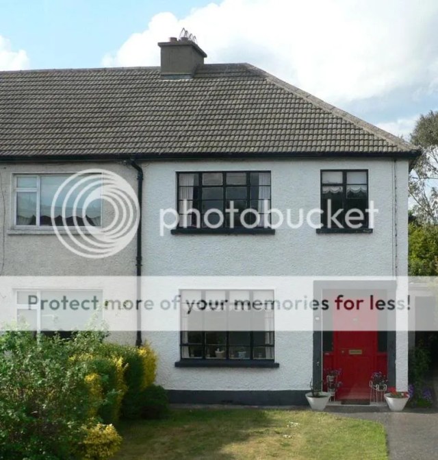
While around the corner near the village, this wonderful house is the second last steel-windowed property on a road of over 80 houses, representing a surviving stock of around 5%.


It has just gone up for sale…
Great typically solid Dublin house out Castleknock way. The garage must have been an early conversion!

Beautifully maintained example in Rathgar.
And a pair of others nearby.


Finally a Corpo house with original joinery. Shock!
 Participant
*sobs uncontrollably*
I suppose some consolation should stem from the vista in any event being entirely obstructed today by the ranks of buses along Eden Quay…
shamrockmetro, the lamps of O’Connell Bridge are not aligned for the simple reason that the bridge is neither aligned with O’Connell Street or Westmoreland/D’Olier Streets due to the angle of the Liffey, and more importantly the off-axis responding developments on both sides of the river. Short of shifting a few tectonic plates, I fear we’re lumped with it.
Interesting views you’ve posted, if the Custom House a ‘tad’ embellished 😉
It’s curious how oddly familiar Ballast House looks in the other view replicated on the site of O’Connell Bridge House. Indeed at first I was half wondering why you posted it, as there didn’t seem to be anything different!Indeed on this very topic, does it frustrate anybody else how poor the exisitng Ballast House is (as reproduced by Michael Scott in the late 1970s)? In spite of its classical character, at the end of the day it’s a heap of junk from a specification perspective, with cladding, dressings and fenestration possessing all the finesse of a steamroller. The window surrounds in particular look like they’ve been cut out of a slab of concrete with a scissors and applied to the facade with Pritt Stick, whilst the brickwork is sullen and prosaic.
Given the office interior is thoroughly dated, the entrance arrangements dismal, and the structural form a concrete frame clad in brickwork, what would people think of the likelihood of a redevelopment, and more specifically the design idiom – and its desirability – of a potential new building/facade? I’d imagine the economics probably don’t stack up, but either way I’d prefer an improving on the detailing and better ground floor treatment to the river front.. Indeed a return to the original WSC design. i.e. minus the dressings, would surely be an improvement.
It’s a wallpaper building we all pass by with little heed, but as things stand is a clunky addition to the most important intersection in the city.
- AuthorPosts