
GrahamH
Forum Replies Created
- AuthorPosts
GrahamH
ParticipantThanks Dunnes for the precedent. Much obliged.
ParticipantThese are all set to go.
All of which, incidentally, fall into the O’Connell Street ACA. Not that that ever mattered since the introduction of ‘exceptional’ ‘world class’ developments.
ParticipantYes it is this fine solid building – looking worse for wear back in 2005.

Lots of original glass up there too.

Absolutely no excuse for demolition, and even more so regarding this terrace on Henry Street, which would appear to be for the chop given the vacant upper floors and short term letting boards.

An absolutely outrageous proposal should this prove be the case.
It is a fine commercial terrace, we’ve already irreparably lost stock here, and have more than our fill of sticky-backed ‘grand entrances’ with the Ilac & Dunnes thanks very much.
ParticipantI think it will have impact, but with the change in pedestrian patterns caused by Arnotts and the new Carlton ‘grand entrance’ to Henry Street, perhaps it won’t be as great as it might be were the new street opened in the morning.
Agreed Upper O’Connell Street has always been quieter dc3, essentially because since construction it has been a commercial street leading into a residential/small business zone. Really my point was that in using the street all the time, you can’t help but be struck at the extent of dereliction that has blighted the west side for so long. The difference a department store in the Carlton alone would have would be enormous. (Of course the counter-arguement would be that such a store wouldn’t survive without other elements).
Incidentally, on this ‘grand entrance’, I don’t understand from what can be gathered why an entire terrace of post-1916ers have to be demolished on Henry Street for this scheme. This is regeneration on its head if the case.
ParticipantRight.
Firstly to deal with the humour.
From Irish Times:
@Mark Turpin of Dublin Central Architects wrote:
“], he believes, is that the unbroken frontage between Henry Street and Parnell Street is too long at 400m”
The reason that Upper O’Connell Street west is as dead as a dodo is because his clients and previous owners have been sitting on their hands for the past 4, c. 7, 14 and 29 years in respect of the swath of properties that lie vacant along here – albeit largely out of their control of late – comprising no less than one third of Upper O’Connell Street west. Have a stroll along here any day and observe the enormous expanses of the derelict Carlton, the vacant site, the empty Fingal offices and the shuttered up Aer Lingus office to gain an appreciation for the real reason why Upper O’Connell Street is now nothing short of a twilight zone. The unbroken length of the street being cited as a main cause of a lack of pedestrian footfall is misguided – one need only look over to Upper O’Connell Street east to observe that the punctuations of Cathal Brugha Street and Cathedral Street have little impact on pedestrian levels. Puncturing a hole into a terrace does not necessarily a busy street make. It is clear that there are wider issues determining activity on Upper O’Connell Street, which are, as we already know, that there is nothing to draw people to the end of O’Connell Street and beyond, nor is there anything to inject vitality en route.
That is not to say that the length of the street is not a contributory factor, nor that it would be undesirable to have a break along its rather stern march northwards – but the extent of this intervention is without question the single most important factor in its consideration. How it is articulated comes second.
As such, the best way to appreciate any possible impact of a new street is simply to stand on O’Connell Street with the proposal in hand and observe. Any notional desktop theory takes the back seat when on location, as naturally ought to be the cause. You realise very quickly that an intervention along the lines of the width of what is proposed (it’s hard to tell exactly at present) would have little impact – even surprisingly – on the form of the O’Connell Street when approaching from the south. However once you pass the Spire and enter into the Upper street it can be truly appreciated the devastating impact that an overly wide, essentially exploded streetscape, could have on the character of the street, and must be avoided. Nonetheless a break of up to the width of the Carlton can be comfortably accommodated, and hopefully that is what is proposed. Anything more is simply overbearing.
On the matter of moving the Carlton itself, it’s undesirable, and without knowing the details of the site could be construed as a lazy way out of avoiding having to deal with the challenge of coming up with a turn-corner solution, integrating the existing facade. We shall await…
With regard to the delightful 1920s neo-Georgian granite faced Garda Station being ‘taken out’, there is little question that this ought and will be thrown out, inevitably on appeal. There is absolutely no reason other than trying an arm for the sake of a few extra metres of modern floorplate that this needs to be removed. It makes a pleasant and perfectly valid contribution to the streetscape, and compromises nothing architecturally of the rest of the scheme. Shunt everything back south by a plot. Such cheek!
On the new builds, the southern corner of the new street is absolute rubbish – incoherent, gimmicky, cumbersome and thoroughly ugly. And why is what will be a single structure being expressed as two different buildings? – this is the Dr. Quirkey’s site. The replacement for Dublin Bus is even worse in its laziness and failing to acknowledge the history its context. Buildings of this scale and width on the street ever since its commercialisation have always made an architectural statement: contextual, but individual. For all its faults, Dublin Bus at least continued this tradition. The proposed structure turns this on its head: reticent, anodyne and ridiculously dull for a building of its scale and status, purely for the sake of appeasing planning. This is Dunnes all over again in red sandstone.
The northern corner is welcomingly ambitious, but makes the opposite mistake of going overboard with its oversailing ‘veil’, as per its (emphatically) rejected Penneys further south – thought at least this site is more accepting of an independent approach. Such projections however do not have a localised impact, and must be considered in the wider context of the street. Indeed for some bizarre reason every single element of the proposed frontage to O’Connell Street features projecting canopies above ground floor level: do they expect global warming to take a new twist?
No point on commenting on the ski slope as it’s stating the obvious: remarkably ugly, ridiculous concept, laughably close to the GPO, and will be rejected outright on appeal. It is a shame that a more elegant expression of height to the centre of the scheme was not considered. 108 apartments is surprisingly low too.
There may be considerable merit in the new streets and squares, but as we haven’t seen them there’s no point on commenting on that front. It appears to be more ambitious that Arnotts.
Generally the scheme is to be welcomed. It will inject vitality, buzzword 1, buzzword 2 etc etc. Upper O’Connell Street on balance could do with a break along its length. The jumbled nature of stock of this stretch (the oldest on the thoroughfare) can absorb a number of contemporary interventions with ease. However the standards of architecture from what (admittedly distant) elements we can see are simply not good enough. Usually criticisms are made of ‘the heritage line’ being too conservative and limiting: in this instance O’Connell Street is deserving of only the very best in contemporary architecture, as was consistently argued ought to be the fundamental tenet of a certain other ‘live’ application on the street. What average building stock survives on the thoroughfare has generally come about through conversion from townhouse to commercial function, and often has historical value. By contrast the finest stock, particularly along this very stretch (and much of which has sadly since vanished) came about through proud rebuilding of premises, from the National Irish Bank, to Gilbeys, to the former Pillar Picture Theatre (McDonalds) to the Carlton. This tradition ought to be continued through high quality, confident contextual interventions – not meek UK high street wallpaper that can be stripped off in 20 years time. This must be central to the planning consideration of this scheme. I look forward to seeing the meat of it to the rear as images emerge!
Participantgunter, I understand where you’re coming from. Indeed I agree with nearly everything you say (as expressed in other threads). However from what I’m seeing across the city, as most evident in fenestration, the opposite is increasingly the case with regard to conservation ethics. Everywhere you turn reproduction Georgian sashes are going back into townhouses and public buildings. Similarly other later additions are regularly being removed and restored back to their former state, often involving replication. Frustratingly, given the countless examples I’ve encountered, none immediately spring to mind save this case in Dundalk where Victorian plate was unnecessarily returned back to Georgian grid (and hideous mock-traditional shopfront applied).


Why retain the c. 1900 shopfront and ironwork but ditch the sashes?
Of course every circumstance is different, and should be treated as such – not in a faddish fashion as is so often the case at the moment. For example plate glass fanlights should generally be returned to their original form where possible, sheet sashes in attic storeys ought to be replaced if it unifies a house, render ought to be stripped if negating from the character of a structure etc etc. By contrast sheet sashes if just a feature of the principal rooms of the typical townhouse generally ought to be retained as an example of both social and engineering change. If however they were installed as part of a heavy-handed institutional use, a case could be made for their replacement. Similarly at Dublin Castle all Victorian sheet in the State Apartments was rightfully removed between the 1960s and the 1980s, thus restoring the wider Upper Yard to its late Georgian appearance. Real commitment to architectural purity was also demonstrated in the removal of the 19th century attic storey from the Bedford Tower, one of the few – if not only – examples in Dublin of such scholarly thought and plain hard cash being invested in a conservation project (even if the storey was also causing structural problems). The reopening of Robinson’s arcade in the 1960s reconstruction a more modest and often unremarked upon example of such considered thought.
Every case is different, and I think a conservation ethos has to be carefully devised according to the scenario faced, but always balancing historic fabric with what’s right for the character of the building, as subjective as that may be.
I believe the correct route was taken regarding the National Gallery House. Just because the shopfront was lost/had to be replaced did not mean the entire house had to be altered accordingly. That would be extreme, unnecessary, and wasteful of both money and extensive historic fabric. If the Victorian alterations had been less all-pervading, a better case could be made.
ParticipantThat is the development’s more flattering form post-alteration. The original concept was truly hideous.


Such unmitigated arrogance. As for the infill to the side…
At least DCC requested that a fifth floor be omitted (even the throwaway design of it indicated they were just trying it on), and the ‘pavilion’ fourth storey be set back by 1.8 metres and continued over the infill block (in itself replacing a three storey 19th century building).
The revised proposal’s sun screen is still too clunky, and the storey needs to be set back more still.

I’m still not pushed on these top-up storeys, but the linear nature of this building can certainly take it better than its Thomas Street colleague.
ParticipantAhhh – well that cetainly puts a different spin on matters. Certainly explains the dubious doorcase. I also thought the chanelling looked a tad weak and very fresh, but let it go. As with Paul, it’s been under wraps for so long I just imagined the ground floor to be like that of the adjacent Tegral house – seems to be where they’ve taken their cue from for the door anyway.
The only record I can find of the building in former times is Shaw’s Pictorial Directory of 1850.

However, if the shopfront was beyond repair and/or significantly altered, a case could be made for its removal and replacement with a form suited to its new use, namely offices. In this instance that would naturally take the form of the original Georgian ground floor facade.
The removal of upper floor additions is not justified in those cirumstances in my opinion, and have rightly been left alone.
Yes the railings are idential to Westland Row, gunter. I couldn’t place where I’d seen them before.
ParticipantAh sure we might as well rip out the ranks of 18th century sashes in Castletown while we’re at it so!

1) Reconditioning of windows to tighten gaps
2) Draught-proofing
3) Secondary glazing
4) Shutters
5) Heavy curtains
6) Strategic placement of radiators@d_d_dallas wrote:
Graham, 10 out of 10 on the doors… yes actual lurid orange plastic wavin pipes! While under construction I used walk past agog at the sight
Feck OFF!!! 😮
Unbelievable. I didn’t think such a new low was possible in this city.
I was wondering how they managed it given free-stranding Georgian doorcases aren’t exactly an off-the-shelf product, and knocking against the ‘columns’ I presumed the hollow ring to be of cheap fibreglass or similar.
But never feckin sewage pipes boxed in plywood!If only such ingenuity could be channelled in the right direction. Truly a new low.
ParticipantIt’s almost like ceramic, and not altogether pleasant at close quarters. A plasticy look and feel to it.

What happened to the original I wonder.
Similarly the spoked glazing bars of the fanlight appear unduly clunky and angular for such a late Georgian house. Maybe a later alteration.

Beautifully fresh paintwork and exposed granite cills which look new.

Although the doorcase looks a bit washed out in the wider expanse of the ground floor – indeed the paint to the quoins and parapet does seem to lean towards the Dulux Weathershield end of the scale (the ground floor is softer). Perhaps it’s mimicking the industrial Victorian paint that was originally used. Dublin grime will tone things down fairly quickly either way…

It looks great adjacent to the Millennium Wing, which I didn’t have time to snap given the traffic.

Not only would the loss of the house have been unfortunate as the whole Millenium Wing project was originally proposed, but in fact I much prefer the modest, narrow, square-like quality of the Millennium facade as built – one of its greatest attributes actually. It’s quietly subtle, and if anything greater design consideration probably went into its smaller form than had it been sprawling along the streetscape. It also slots perfectly into the rhythmic quality of the small units marching along this part of the street.
As an aside, I can’t remember if it’s been mentioned already, but a stainless steel handrail has been inserted down the centre of the dramatic entrance hall stairs. Personally I think it compromises the entire design concept, and especially its execution in tubular sections which just jarr as a factory solution in the starkly angular surroundings. The po-mo painted classical pedestal with floral display at the top of the flight caps it off to unfortunately prissy effect.
Participant12/4/2008
There’s a few threads this topic could have gone into, but here seems the most apt. Indeed what an excellent thread this was in its day – I’ve just spent 20 minutes scrolling through enjoying the many sharp observations. It’s a level of debate that’s relatively unusual here; it seems they come crawling out of the woodwork for the big ones 😉
Well this is just a note to say ‘the National Gallery House’ as it’s generally become known has finally been unwrapped after years of apparent scrabbling for funds and various delays. Arthur Gibney & Partners, who were appointed as architects to the project years ago now, have pulled off the conservation job with trademark panache.

The building is to serve as the new administrative HQ of the National Gallery of Ireland.
Thankfully Gibneys know better than to get sucked into this current trend for returning Victorian sheet sashes to original Georgian specification (though of course merited in the right circumstances). In this case all Victorian additions, as cumbersome as some may be, have been respectfully preserved. Indeed it’s so much more interesting to observe the panels on the internal shutters revealing all in conforming to the original Georgian glazing pattern, than a batch of repro windows pretending to be something they’re not. Thus the fabric has been retained, and the pernickity conservationist/scholar can rest assured on provenance, basking in the warm glow of smug self-assuredness 😉

The brickwork has also been cleaned and tuck pointed.

(The reflection is the scaffolding of Trinity’s buildings across the road).
The grandiose chimneys beautifully are re-rendered and the stucco repainted (sneaky cable running under the frieze there ;))

These robust railings are great – decorous yet elegant.

It would appear some of the granite has been redressed. What’s going on with this corner I’m not sure. You’d expect it to be the original Georgian plinth for a large railing corner piece, but there’s no holes…
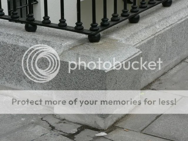
The only thing I’m iffy about is the doorcase. It seems to be of reconstituted stone, as at Parnell Square west. At the very least it’s machine cut and polished.
ParticipantThere is now not a single one of these houses left in its original condition on Pearse Street. You have to round the corner onto Sandwith Street to find just one of these little gems straggling on out of two full terraces.

How long before this too succumbs to developer treatment?
What a loss.

© DevinParticipant12/4/2008
The worst of all possible scenarios aside from wholescale demolition has come to pass in respect of the fomerly delightful pair of classical townhouses at No. 133 and No. 134 Pearse Street, as catalogued above this time last year.
The pictures below serve to demonstrate the disastrous consequences of an historic building not being protected.
2002

2008

These completely unique transitional style houses as built within the old city boundary have been utterly mauled.
Every single facet of their original fabric and detailing aside from the actual brick facade has been ripped out and replaced with ignorant, cumbersome and thoroughly offensive replicas.
The greatest crime of all has been the complete loss of the original charmingly diminutive doorcases, as recorded by Devin earlier.

© DevinNot even the simple spoked fanlights with original glass escaped the heavy hand of this ‘luxury restoration’,

Shockingly, every part of these unique entrance doors has been replaced with a laughably clunky replica.

A satirised Downing Street comes to Dublin, complete with raised and fielded 18th century panels.

The columns appear to be cast from sections of painted Wavin pipe.
Meanwhile the windows, oh mercy the windows…

The absence of glazing bars, the double glazing, the beading, the horns, the catches, the total loss of original frames and shimmering glass – mammy make it go away, please….
Bye bye original simple spoked railings, hello well – what exactly?

High Victoriana crossed with a fire escape.
Bolted with a decorative flourish. Lovely touch.

Meanwhile up on the roof, all of the orginal natural slating has been removed and replaced with synthethic muck.

Indeed it would appear the roof structure hasn’t even been investigated, while the chimneys continue to rot as ever. Also as can be seen, the brickwork has been brashly repointed, although al least it’s lime mortar.
I simply dread to think what has happened inside. not least as it was proposed initially to significantly extend the rear, plonk a mansard roof on top, and squeeze six apartments onto the site, before being refused by DCC on grounds of over-development, lack of open space and non-compliance with minimum apartment sizes. Critically, there’s absolutely no reference online to any of these recent works acquiring planning permission.
ParticipantAh Woodlawn – of course! 😮
ParticipantIt would appear to be it, just moved to the other side of the street for scenic effect?
Funny how similar the above design for the South City Markets is to the chosen one. Suppose there’s only so many ways one can design a heaving Victorian behemoth 🙂
I can see why we got what we did though – who’d choose that leaden yoke over our pinnacled fairytale castle. The chimneys in particular are very weak, and the corner pavilions rather stumpy.The entire facade is now being cleaned by degrees, presumably by owners/tenants. Dunnes currently have scaffolding up right across their portion. It should be due down shortly actually.
ParticipantI have no idea where I got Woodlawn from. It is of course Woodbrook, just outside Bray.
What a silly error – thanks for the clarification.In fairness, all these 70’s suburban estate-sounding places just meld into one 😉
It’d be great if you’ve any decent pics of it, ctesiphon.
ParticipantYup some great views of up there 🙂
Just passing by the other day I noticed a curious little detail – the original segmental heads of the Victorian ground floor windows which are still intact. They’re just concealed behind the 1960’s stonework!

Fancy that.

Talk about cutting costs! Nice to know the original sashes probably survived.
Participant6/4/2007
Just a few shots of the emerging new Gaiety Centre.
View from near the Mercer Hospital showing the canted corner.

Looking west from the Green.

Two substantial storeys underground.

Looking across the ground floor – soon to be adorned with the trademark acres of polished white flooring, black ash shelving and sexy chromed trims of a Zara fitout, and the not so hot lazy industrial look of H&M.

Service core.

This will be stone-clad, as in the render posted above.

Finally, the distinctive steel sections that will support the undulating glazed facade.
 Participant
4/4/2008
I recently came across this photograph. Recognise anyone?

It’s the original breakfront part of the sandstone facade of the College as taken down around 1963-1964, and replaced with the current Portland facings. It now stands as a folly on the course of Woodlawn Golf Cub in Co. Wicklow!
This picture shows the facade in its pristine condition three years ago (yikes it feels like last week I posted this).

Extraordinary how terribly weathered it had become (no wonder it was replaced), and also interesting that the same problem afflicted the same stone on the same street in the case of the National Library and National Museum dressings next door which also decayed extremely rapidly and had to be replaced. Although unlike the Donegal Mountcharles sandstone in the case of the latter, perhaps the College’s had come from Britain. Odd to think the College was once entirely golden in colour (doubt it was red sandstone).
I wonder if they have the rest of the facade down there too. Christine Casey notes that only three deviations were made from the original design when it was refaced by Desmond Fitzgerald. The balustrade of the portico was omitted, the frieze of the portico was made plain so the incised lettering could be employed…

…and square-headed windows with elegant cornices were substituted on the ground floor for the segmental-headed windows (with mildly rounded heads).

This was done as William G. Murray’s original published design for the building featured these square heads, and in any event they work better with the linear nature of the facade.
I love these fully rounded sidelights – beautiful proportions and detailing.

The wider elevation is a tad on the awkward side, but typical of that palazzo style I suppose.

The dark green paintwork is achingly perfect 😉
April 3, 2008 at 12:12 pm in reply to: Steward’s House, Farmleigh to be official Taoiseach’s residence #764752ParticipantYep the vista spot on Peter – always dodgy camera positions that get it wrong! Incidentally the drum of the dome is put to the delightfully ceremonial use of a canteen.
The security savings alone should negate much criticism of a Taoiseach’s residence. A host of new pricey equipment has to be installed in a new house every time there’s a change in the position.
The difference in the Irish situation however is that we already have a Downing Street administrative-wise in the form of Government Buildings, where all ceremonial receptions are also held. There’s Farmleigh and the Castle for larger events. As such only a residence is really required, perhaps with a single reception space. A contemporary new-build would be preferable, given every other aspect of the Oireachtas is houses in a converted shell of one kind or another.
No way should the chairs of the Houses have residences; there isn’t the history attached to the ceremony of the positions as in London.
- AuthorPosts