
National Gallery Extension
- This topic has 100 replies, 39 voices, and was last updated 13 years, 1 month ago by
missarchi.
- AuthorPosts
- March 25, 2002 at 6:29 pm #718659
dmcg
ParticipantI agree too with BM’s reply about the over-worked and self-conscious interior with it’s slits and slashes and holes here there and everywhere. In my opinion anyway it is maddening as the big idea is immense and very powerful but the execution destroys it. Not content with tinkering the interior to distraction they do it to the exterior facade also, plus the finishes are very poor in places but this is a problem I feel they brought on themselves. The feeling of the spaces and big entry scale are fabulous but why couldn’t they have had the confidence to keep it simpler and inject some siza-like calm, cool modesty? Still it’s good to see real architecture growing ever more large and acceptable (even liked!) in the public consciousness.
March 26, 2002 at 6:45 pm #718660Declan
ParticipantEdinburgh was more successful because the niches, cuts, and deep walls were a post modernist reinterpretation of poche within the Scottish Tower house. Likewise the scaling, mass and urban composition worked better in Edinburgh than Dublin (overscaled gestures within a Georgian street compared to a large scaled prominent corner in medieval Edinburgh). The fact that the architects were forced to maintain the adjacent building doesnt excuse the fact that the elevation is poorly composed. The detailing is a virtual return to the fussiness of the Baroque (and badly finshed by the Irish builders in Dublin). All said though, the handling of space and light is superb (cheers Corb).
Supposedly Benson claimed the influence of Ulysses and Dublin lore in the design of the building (cant say I got it)- can anyone throw some light on this?March 26, 2002 at 8:37 pm #718661pvdz
ParticipantIt’s interesting that, after investing fart all cash into this highly successful project, the government, Sile de Valera is preparing to pump EU15 million into a crude pastiche extension to Collins Barracks. Doesn’t it instill such confidence in the powers that guide our arts and culture in this country!
April 2, 2002 at 6:24 pm #718662ParticipantI must also agree with BM’s remarks about the ‘random slits’, which I found completely distracted from the overall building. I felt sheer frustration that excellent simple spaces were left looking like a spotty teenager. Maybe they’re onto something I amn’t aware of, but I just thought Benson & Forsyth were trying to be too clever architecturally by half. The spaces are superb and should have been left to convey their power simply and modestly – like so many of Siza’s works. My great sympathy goes out to the contractor for his having to finish and deal with all these bits – though I don’t think he is, or should be, finished with them yet! Don’t get me wrong I still think it’s an excellent piece of work, and very importantly brings modern architecture ever more centre stage with public life in Ireland, but I feel that the spaces would have benefitted so much more from a ‘less is more’ approach.
April 3, 2002 at 1:15 am #718663DARA H
ParticipantDevil in the detail…
Would i be the only person that thinks that the traffic lights plonked right in front of the building looks pretty awful & cheap? I think even a simple measure such as painting the grey pole in a gloss, black paint would make it look more visually palitable in its position. An all-black pole/lights may even look like an interesting ‘oddity’ set as it is in front an (all white)contrasting building. This gallery is meant to be ‘national’ building so, the protection/ enhancement of its appearence should not stop at its front door.[This message has been edited by DARA H (edited 03 April 2002).]
April 16, 2002 at 8:57 am #718664Paul Clerkin
KeymasterOkay, I finally made it in.
Build Quality
The build quality of the galleries, especially the top galleries seems excellent, I saw one spot which looked like the wall have developed acne but in general it was good. The public spaces seem to suffer from poor finish however, especially corridors like the one that links to the Milltown wing. Its like the curators kicked up a fuss and the decision was made to get the galleries right and the rest would do.Galleries
I loved the top floor gallery, lovely light and space and I didn’t feel that the building got in the way of the paintings at all – a point that has been made about the Museum of Scotland (I disagree with this as well). I like the hidden seats and little places to stop and look out, features I enjoyed in the Museum of Scotland.The elevated walkway.
Arggggghhhhhh the dirty Irish, the roof of the ballroom is covered in litter, even a paper plane when I was there last week. The room across the walkway is the room with the bad dose of wall acne just inside the doorway.The circulation spaces
Dramatic certainly, especially when looking back from the top of the overly steep staircase (it will need a central handrail for safety). I do think that the ‘winter garden’ is wasted on a fitzers restuarant. Such a fine space and such a boring use. Would have made a great sculpture gallery and would allow more to enjoy it as we cannot all afford to be buying lunch.The shop
Massive, a decent selection of architecture booksThe coffee
Dire and overpriced.My overall impression?
Slight disappointment, I just cannot put my finger on why. While its a lovely building, maybe its because I’ve seen it before (in Edinburgh) or maybe it was all the hype before hand. Walking in, I did go “Wow” but it hasnt left that impact on my mind that say the underground segments of the Louvre did or even the Edinburgh version. I do think though that the circulation spaces in our version are better and more dramatic than those in the Edinburgh version.April 16, 2002 at 2:53 pm #718665dc3
Participant“The shop
Massive, a decent selection of architecture books”True,
but it is very very dark. Would have been better in the cafe spot.April 12, 2008 at 11:37 pm #718666GrahamH
Participant12/4/2008
There’s a few threads this topic could have gone into, but here seems the most apt. Indeed what an excellent thread this was in its day – I’ve just spent 20 minutes scrolling through enjoying the many sharp observations. It’s a level of debate that’s relatively unusual here; it seems they come crawling out of the woodwork for the big ones 😉
Well this is just a note to say ‘the National Gallery House’ as it’s generally become known has finally been unwrapped after years of apparent scrabbling for funds and various delays. Arthur Gibney & Partners, who were appointed as architects to the project years ago now, have pulled off the conservation job with trademark panache.

The building is to serve as the new administrative HQ of the National Gallery of Ireland.
Thankfully Gibneys know better than to get sucked into this current trend for returning Victorian sheet sashes to original Georgian specification (though of course merited in the right circumstances). In this case all Victorian additions, as cumbersome as some may be, have been respectfully preserved. Indeed it’s so much more interesting to observe the panels on the internal shutters revealing all in conforming to the original Georgian glazing pattern, than a batch of repro windows pretending to be something they’re not. Thus the fabric has been retained, and the pernickity conservationist/scholar can rest assured on provenance, basking in the warm glow of smug self-assuredness 😉

The brickwork has also been cleaned and tuck pointed.

(The reflection is the scaffolding of Trinity’s buildings across the road).
The grandiose chimneys beautifully are re-rendered and the stucco repainted (sneaky cable running under the frieze there ;))

These robust railings are great – decorous yet elegant.

It would appear some of the granite has been redressed. What’s going on with this corner I’m not sure. You’d expect it to be the original Georgian plinth for a large railing corner piece, but there’s no holes…
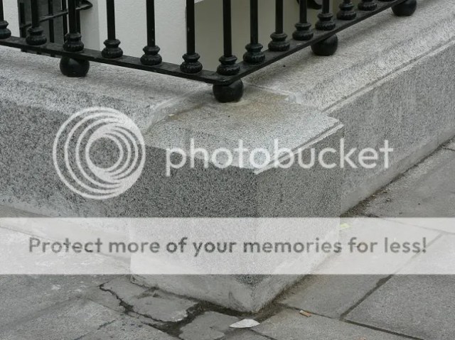
The only thing I’m iffy about is the doorcase. It seems to be of reconstituted stone, as at Parnell Square west. At the very least it’s machine cut and polished.
 April 12, 2008 at 11:45 pm #718667Participant
It’s almost like ceramic, and not altogether pleasant at close quarters. A plasticy look and feel to it.

What happened to the original I wonder.
Similarly the spoked glazing bars of the fanlight appear unduly clunky and angular for such a late Georgian house. Maybe a later alteration.
Beautifully fresh paintwork and exposed granite cills which look new.

Although the doorcase looks a bit washed out in the wider expanse of the ground floor – indeed the paint to the quoins and parapet does seem to lean towards the Dulux Weathershield end of the scale (the ground floor is softer). Perhaps it’s mimicking the industrial Victorian paint that was originally used. Dublin grime will tone things down fairly quickly either way…

It looks great adjacent to the Millennium Wing, which I didn’t have time to snap given the traffic.

Not only would the loss of the house have been unfortunate as the whole Millenium Wing project was originally proposed, but in fact I much prefer the modest, narrow, square-like quality of the Millennium facade as built – one of its greatest attributes actually. It’s quietly subtle, and if anything greater design consideration probably went into its smaller form than had it been sprawling along the streetscape. It also slots perfectly into the rhythmic quality of the small units marching along this part of the street.
As an aside, I can’t remember if it’s been mentioned already, but a stainless steel handrail has been inserted down the centre of the dramatic entrance hall stairs. Personally I think it compromises the entire design concept, and especially its execution in tubular sections which just jarr as a factory solution in the starkly angular surroundings. The po-mo painted classical pedestal with floral display at the top of the flight caps it off to unfortunately prissy effect.
April 14, 2008 at 8:31 am #718668kefu
ParticipantThe railing is a health and safety measure. They had three or four compensation cases relating to tumbles from the beautifully wide staircase and found it very hard to defend them. Unfortunate but another inevitability in our litigious society.
April 14, 2008 at 8:54 am #718669notjim
ParticipantBut it was clear from the start the stairs were dangerous; they should designed them to be safer rather than have an ugly rail retro-fitted. I hate the way the extension is gradually deteriorating, partly through poor maintenance, please fix the doors, repaint the doors, get the inappropriate change box out of the foyer etc and partly because it doesn’t work: the untreated render scuffs to easily, the stairs was dangerous and the circulation is terrible.
April 14, 2008 at 12:41 pm #718670gunter
Participant@GrahamH wrote:
12/4/2008
Well this is just a note to say ‘the National Gallery House’ as it’s generally become known has finally been unwrapped after years of apparent scrabbling for funds and various delays. Arthur Gibney & Partners, who were appointed as architects to the project years ago now, have pulled off the conservation job with trademark panache.
The building is to serve as the new administrative HQ of the National Gallery of Ireland.
Thankfully Gibneys know better than to get sucked into this current trend for returning Victorian sheet sashes to original Georgian specification (though of course merited in the right circumstances). In this case all Victorian additions, as cumbersome as some may be, have been respectfully preserved. Indeed it’s so much more interesting to observe the panels on the internal shutters revealing all in conforming to the original Georgian glazing pattern, than a batch of repro windows pretending to be something they’re not. Thus the fabric has been retained, and the pernickity conservationist/scholar can rest assured on provenance, basking in the warm glow of smug self-assuredness 😉
You can’t nail your colours to the mast like that and not expect people to take pot shots.
I grant you that the Victorians did some great buildings (although not too many in this country), but why did they have to go round tarting up other peoples buildings?
The whole design philosophy behind these Georgian houses was their strict severity, enlivened only by finely detailed doorcases and the elegant proportions of their windows, further articulated by their obsessive refinement of their glazing bars.
For the National Gallery to ‘conserve’ a Victorian tart up version of the upper facade of this house, complete with plate glass windows and frilly strapwork quoine icing detail, and then install a dubious ‘Georgian’ rusticated render ground floor treatment in place of the Victoria’, fully glazed, shop front and generous granite step at street level, is a gutless fudge IMO.
If you’re going to restore the Georgian facade, restore the Georgian facade, don’t nearly restore it and leave it half restored and half disfigured by retaining half the Victorian alterations!
I don’t know where they got those railings, they look like something Trinity had left over from knocking down something on Westland Row.
April 14, 2008 at 12:51 pm #718671tommyt
Participantis it this building or the one next door that is supposed to have a ballroom on the first floor? would be great to see it come into some kind of public use if it is in this one…
April 14, 2008 at 1:24 pm #718672ParticipantThis one had the ballroom in the backgarden, it is the building in the middle of the ground flood eatery.
April 14, 2008 at 2:07 pm #718673KeymasterIt’s been under scaffoldiing for so long that I have trouble remembering – but didn’t this have a decent Victorian shopfront?
April 14, 2008 at 4:17 pm #718674ParticipantMy memory is that it was a full, wall to wall, glass shop front, with rounded granite steps up to a central door. I think it looked like it was designed to be one big shop, but it had been crudely divided into two shops, one of them an iron mongers called Davis something.
I can’t locate any photographs just now.
April 14, 2008 at 6:17 pm #718675ParticipantAhhh – well that cetainly puts a different spin on matters. Certainly explains the dubious doorcase. I also thought the chanelling looked a tad weak and very fresh, but let it go. As with Paul, it’s been under wraps for so long I just imagined the ground floor to be like that of the adjacent Tegral house – seems to be where they’ve taken their cue from for the door anyway.
The only record I can find of the building in former times is Shaw’s Pictorial Directory of 1850.

However, if the shopfront was beyond repair and/or significantly altered, a case could be made for its removal and replacement with a form suited to its new use, namely offices. In this instance that would naturally take the form of the original Georgian ground floor facade.
The removal of upper floor additions is not justified in those cirumstances in my opinion, and have rightly been left alone.
Yes the railings are idential to Westland Row, gunter. I couldn’t place where I’d seen them before.
April 14, 2008 at 7:38 pm #718676KeymasterThe ground floor was an art supply / drawing board shop at one stage…..
April 14, 2008 at 8:24 pm #718677ParticipantGraham:
I’m 95% certain that the shopfront, as shown in Shaw’s, was replaced by a simple all glass affair with a narrow glass door in the centre, but I could be thinking of somewhere else.
If this was the front I’m thinking of, it could have made a great gallery book shop, but, I suppose they didn’t want to diminish the impact of the actual gallery entrance by having a, more visually open, side way in.
Your photographs show that they’ve done a thorough job on the house, my main issue with it is with the selective retention of bits of Victoriana, when the thrust of the effort seems to have been towards the restoration of the house in it’s original Georgian form. I was pretty much of the view that the strapwork details and the big Victorian shopfront (if it was there) all went together, so if You were getting rid of one, why would you not get rid of the other. The same applies to the glazing bars, are we doing Georgian?, or are we doing Victorian?
I don’t know anyone else who shares this view, but I have this real nagging feeling that this generation has lost it’s way on conservation. We seem terrified of being accused of Disneyfication more than anything else. Every conservation project seems to need to scream out ‘Look I’m not pretending to be original’ when we should all just relax a bit and have a bit of confidence in our ability to restore something that’s obviously valuable, when restoration is the logical option.
There’s nothing to stop an architect from putting a small plaque on the front of a restored building, explaining exactly what bits he’s restored, if he thinks there’s any chance someone in the future will be deceived and offended by the high quality of the work.
It seems clear to me that, in contrast to every other branch of contemporary architectural practice, conservation has become dominated by the international charter codes of conduct, and that these sets of predetermined prescriptions have replaced common sense and informed judgement as the tools of the practice.
I could be wrong, but I think this National Gallery House is another example of conservation idealogy getting in the way of conservation common sense. There are bits here to please everyone, as I think you suggested yourself, but, to me, the stand out feature is the compromise. It suited the client’s requirements to close up the ground floor, so the’ve gone down the restoration road, but then, to keep on-side of the Burra Charter, they’ve stop short of removing a few trinkets of the 19th century revamp.
It is a decent job, the property is renovated and finally back in use, but I don’t see a fine Georgian house restored, I don’t see a Victorian make-over reinvigorated, and I don’t see a contemporary statement made. Any one of the above would have done me.
April 14, 2008 at 11:06 pm #718678Participantgunter, I understand where you’re coming from. Indeed I agree with nearly everything you say (as expressed in other threads). However from what I’m seeing across the city, as most evident in fenestration, the opposite is increasingly the case with regard to conservation ethics. Everywhere you turn reproduction Georgian sashes are going back into townhouses and public buildings. Similarly other later additions are regularly being removed and restored back to their former state, often involving replication. Frustratingly, given the countless examples I’ve encountered, none immediately spring to mind save this case in Dundalk where Victorian plate was unnecessarily returned back to Georgian grid (and hideous mock-traditional shopfront applied).


Why retain the c. 1900 shopfront and ironwork but ditch the sashes?
Of course every circumstance is different, and should be treated as such – not in a faddish fashion as is so often the case at the moment. For example plate glass fanlights should generally be returned to their original form where possible, sheet sashes in attic storeys ought to be replaced if it unifies a house, render ought to be stripped if negating from the character of a structure etc etc. By contrast sheet sashes if just a feature of the principal rooms of the typical townhouse generally ought to be retained as an example of both social and engineering change. If however they were installed as part of a heavy-handed institutional use, a case could be made for their replacement. Similarly at Dublin Castle all Victorian sheet in the State Apartments was rightfully removed between the 1960s and the 1980s, thus restoring the wider Upper Yard to its late Georgian appearance. Real commitment to architectural purity was also demonstrated in the removal of the 19th century attic storey from the Bedford Tower, one of the few – if not only – examples in Dublin of such scholarly thought and plain hard cash being invested in a conservation project (even if the storey was also causing structural problems). The reopening of Robinson’s arcade in the 1960s reconstruction a more modest and often unremarked upon example of such considered thought.
Every case is different, and I think a conservation ethos has to be carefully devised according to the scenario faced, but always balancing historic fabric with what’s right for the character of the building, as subjective as that may be.
I believe the correct route was taken regarding the National Gallery House. Just because the shopfront was lost/had to be replaced did not mean the entire house had to be altered accordingly. That would be extreme, unnecessary, and wasteful of both money and extensive historic fabric. If the Victorian alterations had been less all-pervading, a better case could be made.
- AuthorPosts
- You must be logged in to reply to this topic.


